Angel Soft Website Design
COMPANY: Georgia-Pacific
ROLE: Senior Designer. Responsible for concept, layout, and production from concept through completion. Also assisted creative lead with animation art direction and stakeholder presentations.
DELIVERABLES: Website design, UI/UX suggestions and prototyping, digital style guide
DETAILS: In 2023 Angel Soft® redefined their visual identity by developing a new animated world in advertising and packaging. I was overjoyed to lead the design of the major website overhaul that followed. Our goal was to create a website experience that embraced the humor and charm of the new brand guidelines, addressed outdated design and functionality, and increased conversion.
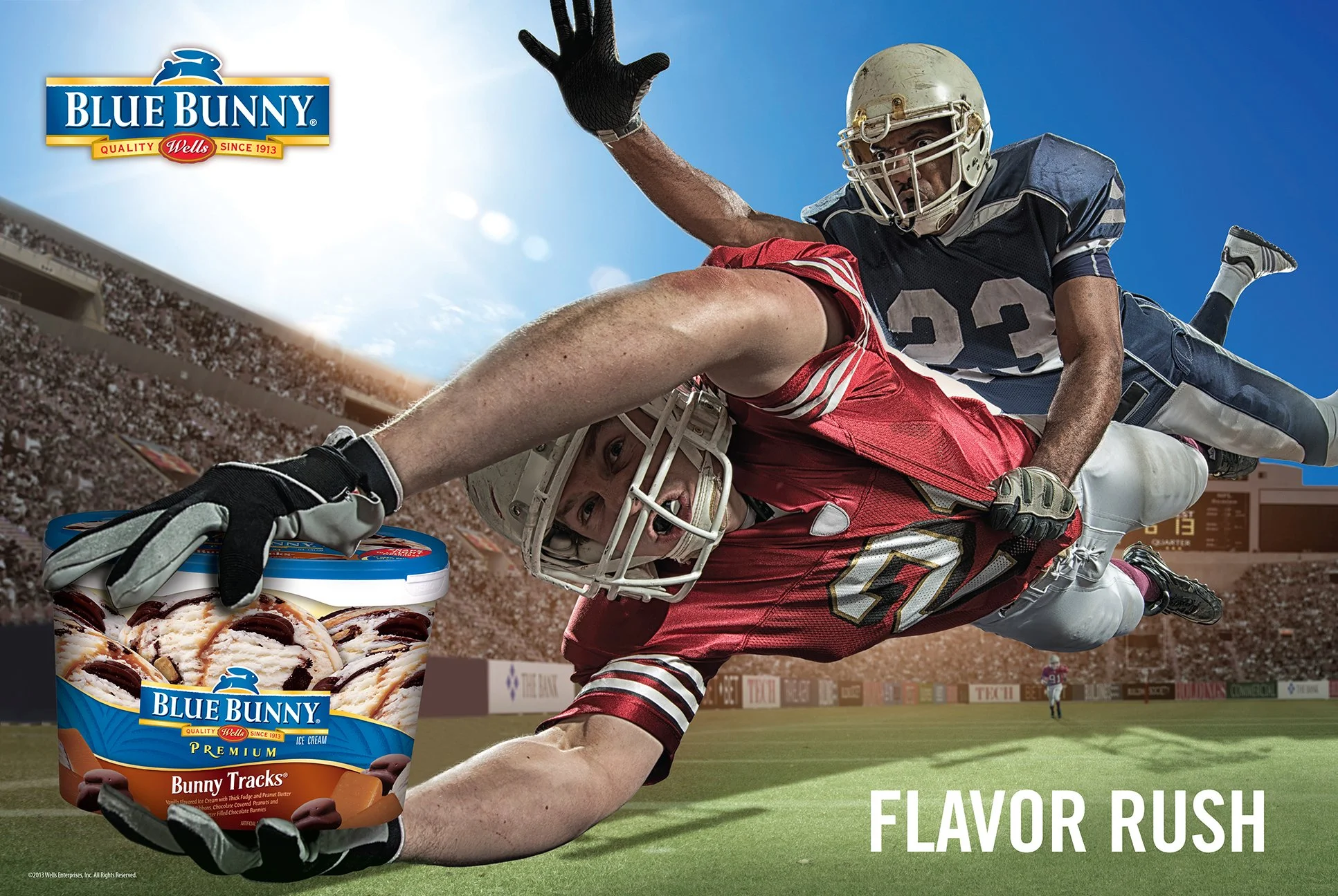
Blue Bunny: Fall Seasonal Ads
CLIENT: Blue Bunny
AGENCY: Blue Chip
ROLE: Art Director & Designer. Responsible for concept, layout, photography sourcing, retouching, and production from concept through completion.
USAGE: In-store seasonal posters (24"x36"), Blue Bunny official website, Facebook
DETAILS: Years before embracing a bunny as the company’s “face,” Blue Bunny’s branding was product-centric, utilizing a large product shot against a blue background. During this time my team and I urged Blue Bunny to consider aesthetics that went beyond traditional product shots and copy. In the spring of 2013 when Blue Chip was asked to “go big” with a new freezer aisle campaign, I knew I had my opportunity to shift the dial. Straying from their standard window cling marketing, Blue Bunny asked Blue Chip to create fall seasonal posters that would rotate on a month-to-month basis. My concepts were inspired by the classic song, “I Scream, You Scream, We All Scream for Ice Cream,” conveying fall scenes where screams and fun intermingle. The results were well received - Blue Bunny not only deployed the posters, but also used each as the main image for their Facebook and official website.


Dixie Ultra Social Ads and pinterest content
COMPANY: Georgia-Pacific
ROLE: Art Director. Alongside our team’s Senior Art Director, I was responsible for storyboarding concepts and articulating artistic vision, deliverable requirements, and timing to exterior agency partner Accenture Song. Other responsibilities included providing creative feedback for all stages of videos, photography, image sourcing, and retouching; assisting with developing the final Scope-of-Work guide for 3.5 days of studio shoots - sourcing talent, selecting featured meals, providing food styling and set design suggestions, and outlining video production details and shoot times.
DELIVERABLES: 24 stills and short-form videos of summer, winter, and evergreen content for Pinterest, Facebook, and Instagram
DETAILS: The Dixie® brand’s “Make It Right” campaign (GP x Leo Burnett) was effective on channels with longer-form video (i.e. TV/CTV) but the brand did not have a consistent presence in social media. After having many one-off social executions that did not tie back to the campaign, Dixie® was looking to deliver consistent content to bring the campaign to life in social media. Treehouse, Georgia-Pacific’s internal agency, teamed up with Accenture Song to leverage the spirit of the “Make It Right” campaign. Together we created content that demonstrated how Dixie can “Make It Right” no matter the meal or season. Our goal was to motivate 1.5 million new purchasers to choose the Dixie® brand 2x per year instead of foam or private Label plates and increase usage with existing Dixie® buyers.
Reasons to Believe: Summer
Reasons to Believe: Winter
Reasons to Believe: Evergreen
Handles It All: Summer
Handles It All: Winter
Handles It All: Evergreen

Store Brand Showdown: Enchiladas
Store Brand Showdown: Chinese Takeout
Publix: A Beautiful, Healthy You Multi-brand endcap design
CLIENT: P&G, Publix
AGENCY: Blue Chip
ROLE: Lead Designer. Responsible for photo sourcing and development, design, and production of all display elements (typography, logos, header card, touch screen, shelf blockers, and shelf strips).
USAGE: Health & beauty category sell-in concept presented to Publix


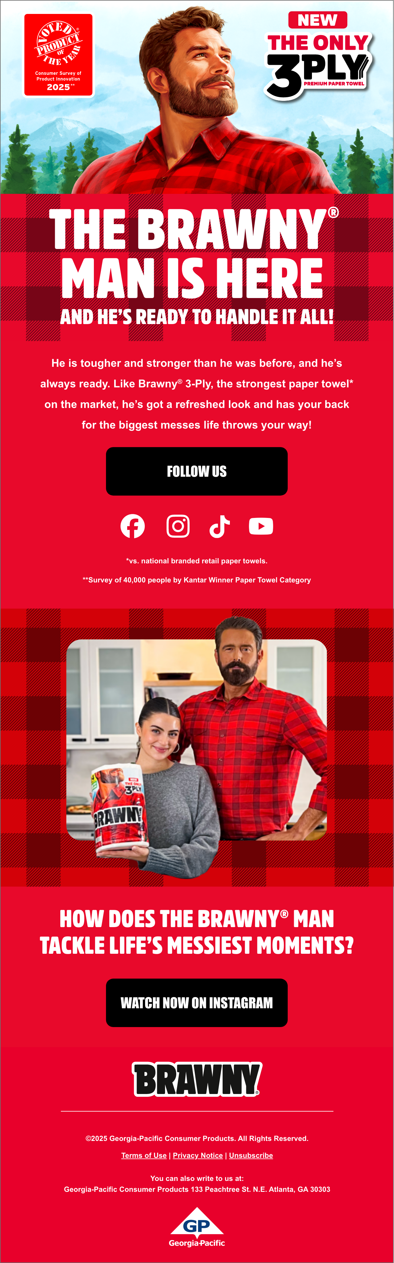
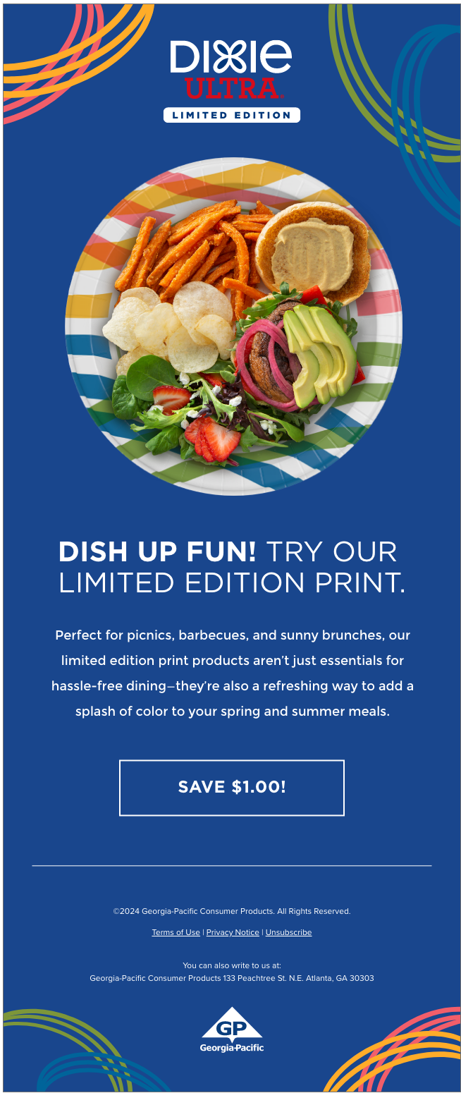
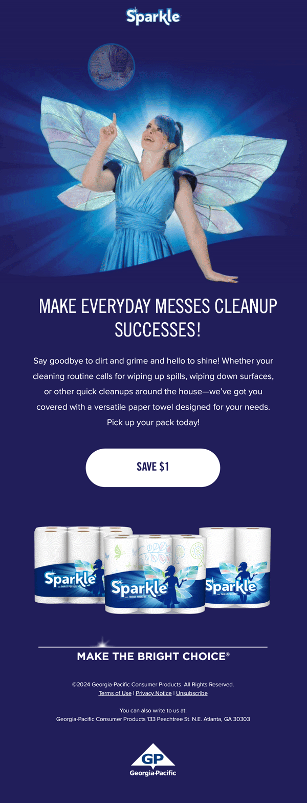
Georgia-Pacific Retail brands: emails
COMPANY: Georgia-Pacific
ROLE: Senior Designer. Responsible for concept, layout, and production from concept through completion.
DELIVERABLES: Emails
DETAILS: One of my main responsibilities at Treehouse, Georgia-Pacific’s in-house agency, is designing e-mails for our retail brands - Angel Soft®, Brawny®, Dixie®, Quilted Northern®, Sparkle® Paper Towels, and Vanity Fair® Napkins. Since joining the company in September 2022, our email program’s open rates increased from 33% to 38% and CTRs climbed from 1.4% to 1.75%.
AWARDS:
Angel Soft® New Brand Campaign Launch Emails: 2023 MARCOM Awards PLATINUM Winner in the Advertising/Marketing | Email Communication | 66c. Email Campaign category
Quilted Northern 2023 Email Campaign: 60TH GDUSA ANNUAL SHOWCASE WINNER in the Direct Mail + Email Marketing category.


Blue Chip: Shopper Infographic
CLIENT & AGENCY: Blue Chip
ROLE: Art Director & Designer. Responsible for design, layout, and production from concept through completion. Illustrations are a combo of edited stock vectors and new drawings.
USAGE: Large-scale (4' x 11') printed infographic for client-facing meeting.
DETAILS: This was the key visual and point of discussion that the BC Media Department used in a meeting with P&G. For their presentation, media wanted to break the "Power Point Norm" of other presenters and use a printed graphic to convey shopper insights. This colorful infographic captured everyone's attention and also received kudos from Stanton Kawer, the CEO of Blue Chip. Retailer names and branding removed for confidentiality.
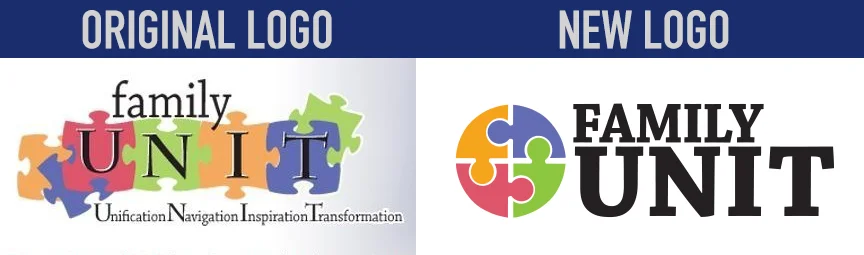
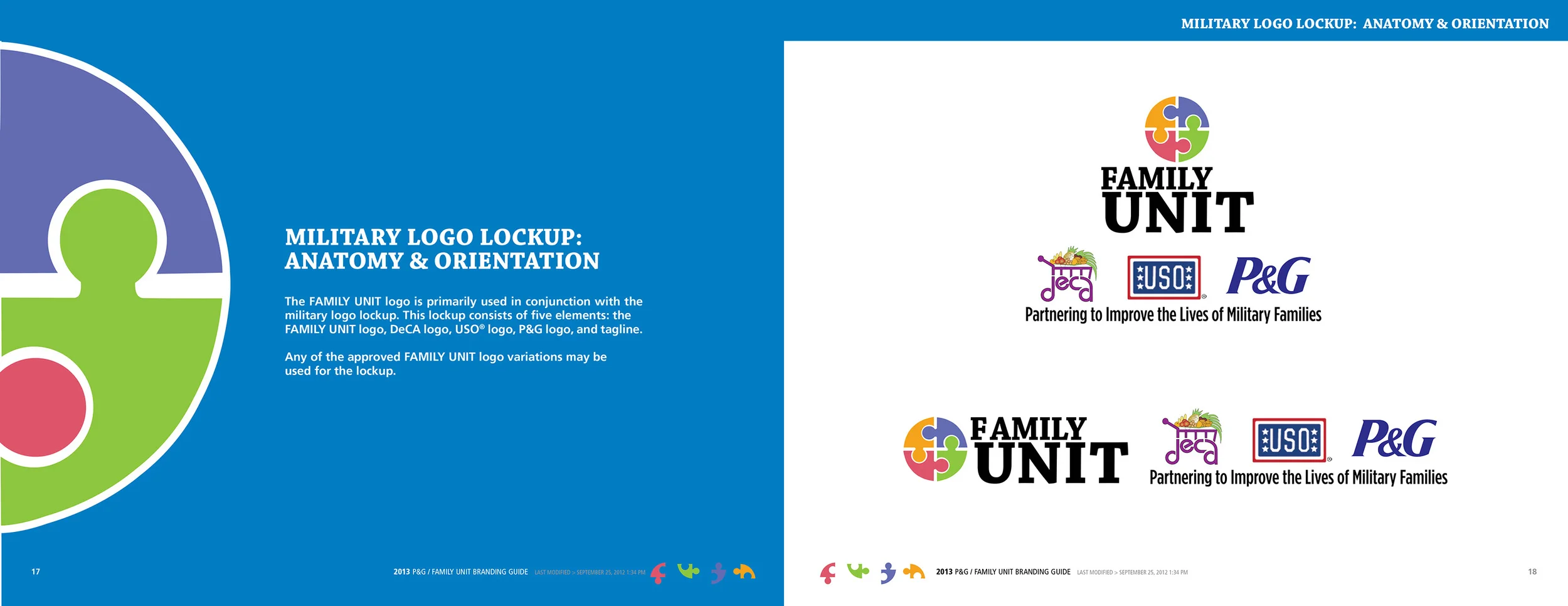
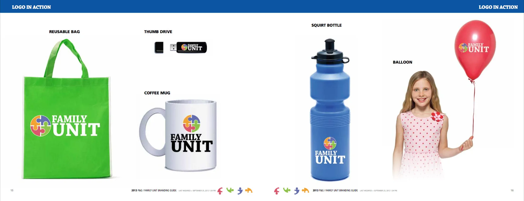
P&G Family unit: logo refresh and style guide creation
CLLIENT: P&G, USO
AGENCY: Blue Chip
ROLE: Lead Designer. Responsible for developing a new logo design, visual branding, and style guide creation from concept to completion.
USAGE: In-store POP, print ads, event activations, Facebook, web and apparel.
NOTABLES: The merchandise guidelines inspired P&G to create Family Unit flash drives that were distributed throughout US military bases.
DETAILS: In 2009, P&G, DeCA and the USO partnered to positively impact the lives of military families. They created the Family Unit, a platform that is focused on helping the military family through savings, information and support. In 2012 P&G approached Blue Chip because they felt the original logo for the program appeared too busy and flimsy. In addition to refreshing their existing logo, Blue Chip was asked to develop a style guide so Family Unit pieces across every channel were consistent. Overall P&G liked the concept of using puzzle pieces for the logo, but were looking for something more sturdy and modern. Since the original logo felt scattered to me, I locked-up (simplified) puzzle pieces in a circle to convey unity and solidarity. I chose a bold serif font so it would stand out at smaller sizes and also look great on the web. For the style guide, I relied on the bold colors of the logo paired with iconic P&G blue to create easy to understand guidelines.